

Widgets
Plugin panels, dialogs and Properties sections draw with the same widgets as Modlumi’s own panels, so they look and behave like the rest of the app. This page shows each one, drawn by the Widget Gallery example plugin at the end of the page.
Widgets are immediate: a panel’s draw(ui) runs every frame, and each value
widget takes the current value and returns it, or the user’s change of it.
Keep the values in your plugin and pass them back in on the next draw:
const state = { width: 1.2, steps: 12 };/** @param {modlumi.Ui} ui */export function draw(ui) { state.width = ui.length("Width", state.width, { min: 0.1 }); state.steps = ui.integer("Steps", state.steps, { min: 1 });}A widget is identified by its label within the sections, tabs and columns
around it. Give a widget whose label changes an id. Every widget takes a
tip, shown while it is hovered, and disabled. See
Writing a plugin for when
a draw may edit the model.
Fields
Section titled “Fields”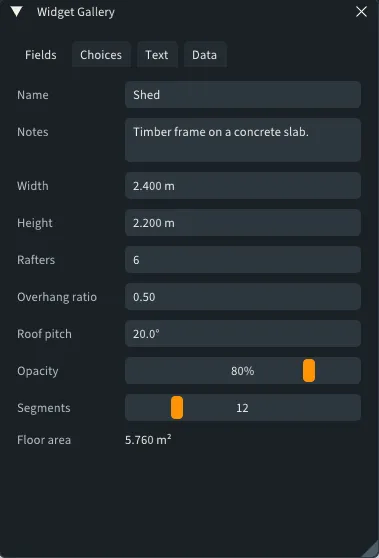
| Widget | Value |
|---|---|
textField |
A string, with an optional hint shown while it is empty. |
textBox |
A string over several wrapped lines. |
length |
Meters, shown in the model’s units. It accepts what the measurements box accepts, such as 1.2m, 18cm, 7" or 5' 3 1/2". |
number |
A decimal number, shown with decimals places. |
integer |
A whole number. |
angle |
Radians, shown and typed in degrees. |
slider |
A number from min to max, with a suffix such as %; integer: true keeps it whole. |
readOnly |
Shows a value that can’t be edited. |
Typed fields keep their value while the text is invalid or out of the min
and max range: the field is outlined in red, says why on hover, and goes back
to the value when it loses focus.
Choices and buttons
Section titled “Choices and buttons”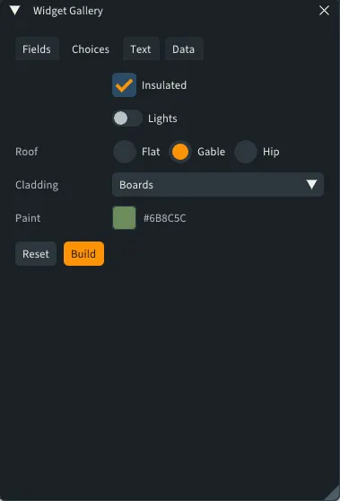
| Widget | Value |
|---|---|
checkbox |
A boolean. |
toggle |
A boolean, for settings that apply right away. |
radio |
One of a few strings, shown side by side. |
dropdown |
One of many strings, from a list. |
color |
A color with r, g, b and a from 0 to 1; alpha: true edits a too. |
material |
One of the model’s materials, shown with their colors, or null for the default material. |
button |
Returns true in the draw that reports the click; primary: true for the main action. |
Text and layout
Section titled “Text and layout”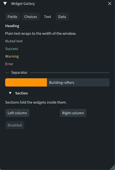
textwraps to the window, in atoneof"normal","muted","success","warning"or"error".heading,separatorandspacingstructure longer panels.progressshows a fraction from 0 to 1.imageshows an image the plugin loaded withcontext.loadImageor made withcontext.createImage, at its own size or at awidthorheight.sectionfolds the widgets its function draws,rowplaces them side by side,columnssplits them into equal columns andtabsinto pages.disabledgrays out what it draws.formdraws one field per entry of a schema, for simple parameter lists.
Consecutive fields line up in a form, labels on the left.
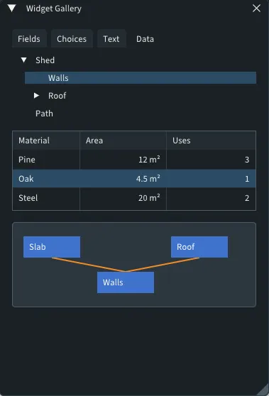
tree shows nested items, such as an outliner.
Pass the selected item’s id, or null, and get the user’s choice back. Items
start folded unless they are open; the arrows fold and unfold them.
/** @type {string | null} */let selected = null;/** @param {modlumi.Ui} ui */export function draw(ui) { selected = ui.tree("Parts", [ { id: "house", label: "House", open: true, children: [{ id: "roof", label: "Roof" }] }, { id: "garden", label: "Garden" }, ], selected);}table shows rows of cells under column
titles. Clicking a header sorts the rows by that column; cells that start with
a number, such as "4.5 m²", sort by the number. Mark a column numeric to
right-align it. Pass the selected row’s id, or null, to select one row; pass
an array of ids to let Ctrl+click and Shift+click select several, and get an
array back.
/** @type {string[]} */let selected = [];/** @param {modlumi.Ui} ui */export function draw(ui) { const rows = modlumi.activeModel.entities.ofType("Face").map((face) => ({ id: String(face.entityId), cells: [`Face ${face.entityId}`, modlumi.activeModel.formatArea(face.area)], })); selected = ui.table("Faces", ["Face", { title: "Area", numeric: true }], rows, selected, { visibleRows: 8 });}Canvas
Section titled “Canvas”canvas is a drawing area as wide as the
window, for diagrams such as a node editor or a sun path. Its function draws
lines, polygons, rectangles, circles and text in
pixels from the canvas’s top-left corner, y down, and receives what the user
did with the mouse: a "click", "doubleClick", "drag" or "release", with
the position, a drag’s movement and the id of the shape under the press.
Handle the event before drawing, so the shapes show its effect right away:
const node = { x: 20, y: 20 };/** @param {modlumi.Ui} ui */export function draw(ui) { ui.canvas("Nodes", 160, (canvas, event) => { if (event?.type === "drag" && event.item === "node") { node.x += event.dx; node.y += event.dy; } canvas.rect(node.x, node.y, 80, 30, { id: "node", fill: { r: 0.25, g: 0.45, b: 0.8, a: 1 } }); canvas.text([node.x + 8, node.y + 6], "Drag me"); });}Only shapes with an id are hit, the last drawn first. Lines and outlines are
hit within a few pixels and fills anywhere inside; a shape’s parts that aren’t
drawn, such as an outline with stroke: null, are never hit.
Example: Widget Gallery
Section titled “Example: Widget Gallery”Widget Gallery ships with Modlumi in examples/plugins/widget-gallery. Copy
that folder into your plugins folder, opened from Extensions → Manage
Extensions…, and open the panel from Extensions → Widget Gallery.
// An example plugin: a panel that shows every widget, one tab per kind, with the values it// keeps between draws.
/** @type {modlumi.Color} */const kBlue = { r: 0.25, g: 0.45, b: 0.8, a: 1 };/** @type {modlumi.Color} */const kOrange = { r: 0.95, g: 0.55, b: 0.15, a: 1 };
const state = {  name: "Shed",  notes: "Timber frame on a concrete slab.",  width: 2.4,  height: 2.2,  count: 6,  ratio: 0.5,  pitch: Math.PI / 9,  opacity: 80,  segments: 12,  insulated: true,  lights: false,  roof: "Gable",  cladding: "Boards",  paint: { r: 0.42, g: 0.55, b: 0.36, a: 1 },  /** @type {modlumi.Material | null} */  roofing: null,  /** @type {string | null} */  part: "roof",  /** @type {string | null} */  material: null,  /** @type {string[]} */  parts: [],  /** The nodes on the canvas, which the user drags around. */  nodes: [    { id: "slab", label: "Slab", x: 16, y: 20 },    { id: "walls", label: "Walls", x: 120, y: 70 },    { id: "roof", label: "Roof", x: 224, y: 20 },  ],};
/** @param {modlumi.Ui} ui */function drawFields(ui) {  state.name = ui.textField("Name", state.name, { hint: "Untitled" });  state.notes = ui.textBox("Notes", state.notes, { lines: 2 });  state.width = ui.length("Width", state.width, { min: 0.5, tip: "Type 8', 2.4m or 240cm" });  state.height = ui.length("Height", state.height, { min: 0.5 });  state.count = ui.integer("Rafters", state.count, { min: 2, max: 40 });  state.ratio = ui.number("Overhang ratio", state.ratio, { min: 0, max: 1, decimals: 2 });  state.pitch = ui.angle("Roof pitch", state.pitch, { min: 0, max: Math.PI / 3 });  state.opacity = ui.slider("Opacity", state.opacity, { min: 0, max: 100, decimals: 0, suffix: "%" });  state.segments = ui.slider("Segments", state.segments, { min: 3, max: 48, integer: true });  ui.readOnly("Floor area", modlumi.activeModel.formatArea(state.width * state.width));}
/** @param {modlumi.Ui} ui */function drawChoices(ui) {  state.insulated = ui.checkbox("Insulated", state.insulated);  state.lights = ui.toggle("Lights", state.lights);  state.roof = ui.radio("Roof", state.roof, ["Flat", "Gable", "Hip"]);  state.cladding = ui.dropdown("Cladding", state.cladding, ["Boards", "Shingles", "Metal", "Render"]);  state.paint = ui.color("Paint", state.paint);  state.roofing = ui.material("Roofing", state.roofing?.isValid ? state.roofing : null);  ui.row(() => {    ui.button("Reset");    ui.button("Build", { primary: true });  });}
/** A gradient from blue to orange, made when the plugin starts. @type {modlumi.PluginImage | null} */let gradient = null;
/** * Makes a horizontal gradient of width by height pixels between two colors. * @param {modlumi.PluginContext} context */function makeGradient(context, width = 64, height = 8) {  const pixels = new Uint8Array(width * height * 4);  for (let x = 0; x < width; ++x) {    const t = x / (width - 1);    for (let y = 0; y < height; ++y) {      const at = (y * width + x) * 4;      pixels[at] = Math.round(255 * (kBlue.r + t * (kOrange.r - kBlue.r)));      pixels[at + 1] = Math.round(255 * (kBlue.g + t * (kOrange.g - kBlue.g)));      pixels[at + 2] = Math.round(255 * (kBlue.b + t * (kOrange.b - kBlue.b)));      pixels[at + 3] = 255;    }  }  return context.createImage({ width, height, pixels });}
/** @param {modlumi.Ui} ui */function drawText(ui) {  ui.heading("Heading");  ui.text("Plain text wraps to the width of the window.");  ui.text("Muted text", { tone: "muted" });  ui.text("Success", { tone: "success" });  ui.text("Warning", { tone: "warning" });  ui.text("Error", { tone: "error" });  ui.separator("Separator");  ui.progress(0.4, { text: "Building rafters" });  if (gradient !== null) {    ui.image(gradient, { width: 240, height: 12 });  }  ui.section("Section", () => ui.text("Sections fold the widgets inside them."));  ui.columns([() => ui.button("Left column"), () => ui.button("Right column")]);  ui.disabled(true, () => ui.button("Disabled"));}
/** @param {modlumi.Ui} ui */function drawData(ui) {  state.part = ui.tree(    "Parts",    [      { id: "shed", label: "Shed", open: true, children: [        { id: "walls", label: "Walls" },        { id: "roof", label: "Roof", children: [{ id: "rafters", label: "Rafters" }] },      ] },      { id: "path", label: "Path" },    ],    state.part,  );  ui.spacing();  const rows = [    { id: "pine", cells: ["Pine", "12 m²", 3] },    { id: "oak", cells: ["Oak", "4.5 m²", 1] },    { id: "steel", cells: ["Steel", "20 m²", 2] },  ];  state.material = ui.table(    "Materials",    ["Material", { title: "Area", numeric: true }, { title: "Uses", numeric: true }],    rows,    state.material,    { visibleRows: 3 },  );  ui.spacing();  ui.canvas("Nodes", 120, (canvas, event) => {    // Dragging a node moves it before this draw shows it.    const dragged = state.nodes.find((node) => node.id === event?.item);    if (event?.type === "drag" && dragged) {      dragged.x += event.dx;      dragged.y += event.dy;    }    const [slab, walls, roof] = state.nodes;    canvas.line([[slab.x + 40, slab.y + 30], [walls.x + 40, walls.y]], { stroke: kOrange, width: 2 });    canvas.line([[walls.x + 40, walls.y], [roof.x + 40, roof.y + 30]], { stroke: kOrange, width: 2 });    for (const node of state.nodes) {      canvas.rect(node.x, node.y, 80, 30, { id: node.id, fill: kBlue });      canvas.text([node.x + 8, node.y + 6], node.label, { stroke: { r: 1, g: 1, b: 1, a: 1 } });    }  });}
/** @param {modlumi.PluginContext} context */export function activate(context) {  gradient = makeGradient(context);  const panel = context.addPanel({    id: "gallery",    title: "Widget Gallery",    width: 380,    height: 560,    draw(ui) {      ui.tabs({        Fields: () => drawFields(ui),        Choices: () => drawChoices(ui),        Text: () => drawText(ui),        Data: () => drawData(ui),      });    },  });  context.registerCommand({    id: "open",    title: "Widget Gallery",    tip: "Shows every widget a plugin panel can use.",    run: () => panel.show(),  });}